ThredUp Rewards

Launching a loyalty program
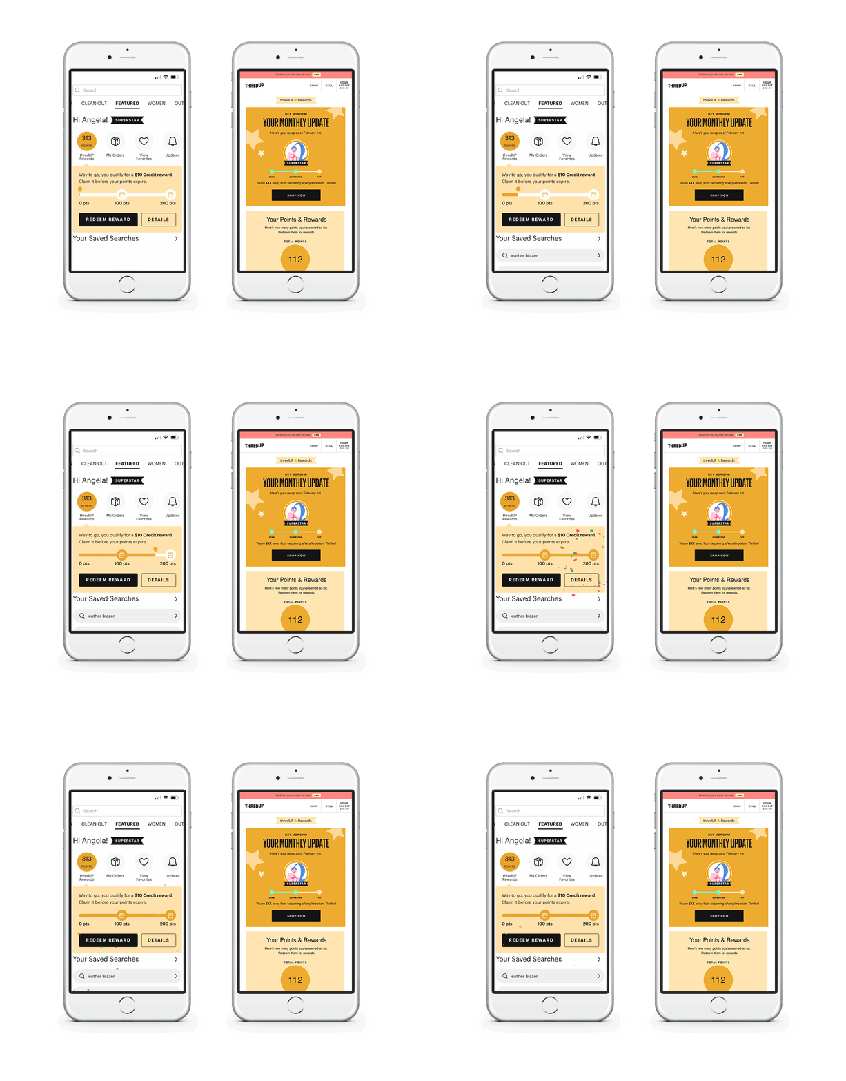
ThredUp introduced its first loyalty program to drive retention and engage customers with rewards. Building off the existing brand elements, I developed the visual toolkit of the new program to make it fun and delightful. I utilized custom illustrations to bring each tier to life and give the customers a recognizable avatar for each level. I worked closely with the product and engineering team to design a dashboard and organize the information architecture of the landing page.
Progress Bar and Gamification
We added a progress bar to the mobile homepage to help educate customers on rewards, while also driving engagement and stickiness with the program by getting customers to continually check the app. After doing several rounds of testing the layout of points vs tier progress, we discovered it was more impactful to show points and rewards available. Customers who saw the points progress bar converted at a higher rate, were more profitable, and engaged with the loyalty program more.
Eco Impact and Sustainability
ThredUp’s mission is to inspire a generation to think secondhand first. We want customers to thrift for the environment and feel good about their purchases. We added an eco impact section to the dashboard so we can weave in sustainability through the program and remind customers how much carbon, water, and energy they are saving when they shop with ThredUp. These eco stats also continue to gamify the program and provide future avenues to create badges or awards to the most sustainable customers.


